Whenever we mention that we work with hypnotists, there are always plenty of smart comments about our minds being controlled, or being mesmerised into working for free. And this is a problem with hypnosis in general – the entertainment, comedy stage hypnosis most people think of first overpowers the role hypnosis plays in healthcare.
The European Society of Hypnosis comprises of medical professionals who use hypnosis in their work as psychologists, psychotherapists, dentistry and other medicine. The society is, in fact, a society of societies. Each country has at least on organisation for medical hypnosis and the ESH brings all of these 45 separate European societies into one in order to share research and promote the highest professional standards across Europe.
Or task was twofold:
- Rebrand and give the organisation the professional, trusted feel it needs.
- Rebuild their website and make it the central point for all European hypnosis research and collaboration.
The Brand
It’s an old cliché that a racehorse designed by committee is a camel – i.e. when too many people have input on a project, the result of adding all of their good ideas together becomes not a sum of all of the best parts but a disjointed, ugly hybrid. The ESH is a committee made up subcommittees of members of other committees! On top of that, each member of the board is from a different country and culture and speaks a different language. It’s well known that different countries and cultures have wildly different ideas about what looks good – even the same colour can represent life in one country and death in another. We needed to focus on the horse!
Rather than entering into the cycle of coming up with hundreds of brand options, inviting comments, refining and asking again, we decided we needed to keep a tight control on the process but, at the same time, make all the members feel like they were part of it. So we spent more time talking and writing before moving onto any design. The one thing that was unanimous was that we should steer away from spirals, concentric circles, eyes, etc. – all the done-to-death imagery associated with hypnosis. It was clear that a European map was high on everybody’s list. The other thing which helped was the the ESH has adopted English as its official language, so we were able to use a typographical approach when it came to the logo. Finally, everybody agreed that they didn’t want to move too far from their old look and there must be some nod back to the origins of the society.
The most important breakthrough came when we decided we were branding a society not hypnosis itself. It freed us from the problems with hypnosis gimmickry we had already identified. We also spoke a lot about what our idea of “European” was. A task made all the more challenging by the fact that Brexit was rumbling on and becoming ever more toxic. Even a reshuffle in the society’s top tier of leadership didn’t derail us.
Colour
We went for a limited palette of dark turquoise, dark grey and light grey. These colours looked trustworthy, clean and professional whenever we tried them out on print and web applications.
Type
We thought Futura was a great choice for ESH as it’s a classic with very European influences. The sharpness of the “N”s and “Z”s along with the precise, geometry of the curves gives a scientific feel but with the elegance of signs you might see at a European art gallery. It also has a good set of weights which make it quite flexible for layouts and copy.
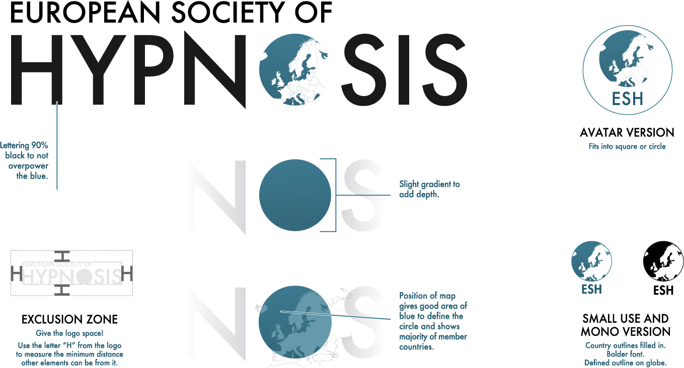
The Logo
The existing logo had been around for over twenty years. Our issues with it were:
- Tries to do too much all at once. The eye doesn’t know whether to look at the map, follow the text round the arc or read the strapline, whilst all the time being pulled to the overpowering gradient block at the bottom.
- Very literal (map).
- Too much detail on the map – doesn’t work at small sizes.
- It says “European Society of Hypnosis” and then repeats itself by having “ESH”. There’s also a map of Europe. Three Europes in such a small space!
- The strapline is way too long, meaning the type is very small and disappears in most use cases.
The thought process:
- Everybody is so keen on the map that we still needed it. We decided to make it more representational than a Google Earth screen grab. We went for flat vector illustration. We also sliced some of the countries off to keep the balance between negative and positive (we have, of course, apologised to those countries). The map triggers the idea of Europe with the viewer without actually being 100% geographically accurate.
- The thing needs to scale well.
- Lets be minimal with the colours and shapes. Get a feel of trust, science. Relaxed but also precise.
- As the symbol is a circle, let’s make use of Futura’s “O” being an “almost” perfect circle and replace it, instead of having a symbol/word layout.
- Mainly, make the logo look like it’s been thought about rather than thrown together.
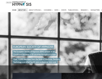
The Website
The website brief was simply a continuation of the same concepts covered in the branding: professional, gimmick-free, trustworthy and clean.
The site needed to do the following:
- News and news archive.
- Events calendar.
- Social media feeds.
- News and details about their Congress (their main meeting which happens every three years and elects their board of directors).
- Archive of past Congresses (going back to 1978).
- Information about each board members.
- A list of all internal committees
- Articles written by members for the site and links to articles published elsewhere.
- Reviews of publications
- The latest newsletter.
- Archive of all past newsletters.
- Signup area.
- Member profile pages which allow them to add their own content.
To the brief we added the need for:
- A dynamic home page.
- Large, distinctive imagery.
- A consistent, distinctive colour palette.
- Organisation of the large number of pages and sub-pages into a logical order.
- Pages which could only be seen / updated by members.
Navigation
The site has a large page count and we spent some time categorising and organising the information to make everything easier to find. To get to these pages, the navigation had to be undaunting and simple despite the number of links. We went for “megamenu”-style dropdowns backed up with lower “related pages” shortcuts where needed. This also helped the site to work well on mobile devices, unlike the previous site which had been built before the advent of smartphones and tablets.
Visual
We had already enforced a strict brand guide as a lot of ESH’s output is produced by different people in different places. This had led to serious inconsistencies in the way their documents, newsletters and other communications had looked in the past, with members often going off in their own direction. Even the regular newsletter struggled to keep to the same look from one issue to the next. It was important, therefore, to work to a set of rules ourselves as we were creating the site and to then pass those rules over to the ESH when it was time for them to take back the running of the site.
The site needed some large pictures and we decided to use a full-background approach, with imagery covering the entire page. The page content was pushed down to reveal the top part of each background image and the rest fell behind the content. This meant that the choice of photographs was important, so we set the following criteria for ourselves, and then the ESH for future updates:
- Black and white or very limited colours.
- No words or distracting small details to battle against the page content.
- A tall rather than a wide proportion.
- Lots of visual interest near the top of the photograph.
- Moods of reflection, peace, thought, analysis and relaxation.
- No gimmickry or standard stock imagery.
- Steer clear of actual, literal hypnosis / clinical situations and think about benefits, research and ideas.
The images we picked were a combination of originals from our own library and some from relatively obscure stock sites which matched the criteria.
Platform
The original site used WordPress and the ESH wanted to continue with this as their staff are used to updating the site.
A brand-new addition was a user-only area which allows members to have their own profile and home page to share information, their own publications and promote collaborations and contributions to their research from other members.
Comments from the Board of Directors
“A breath of fresh air.”
“A major step forward.”
“A fantastic job. Well done!”