As we provide such a complete service, it's always hard trying to sum it all up. We think the best way is to let the work speak for itself so here's a selection of some of our most recent projects.
Enhancing YPO’s ordering efficiency and innovation through a Business Central integration.
About YPO
YPO (Yorkshire Purchasing Organisation) is a leading supplier of goods and services, primarily catering to educational and public sector organizations. They focus on delivering value and savings through their comprehensive offerings, aiming to support and enhance the efficiency of these institutions.
Challenge & Purpose
YPO needed to enhance their purchase ordering system for greater efficiency and integration with their Business Central Microsoft solution.
Solution
We developed a bespoke portal, seamlessly integrated with YPO’s Business Central platform, to streamline and elevate their ordering process. This strategic fusion not only optimized operations but also enabled future scalability and improvements.
Key Takeaway
The project underscores the transformative impact of custom solutions, particularly when integrated with key business systems, driving operational excellence and providing a robust foundation for growth and innovation.

Website for an international charity which showcases their work, raises money and recruits volunteers.


![]()
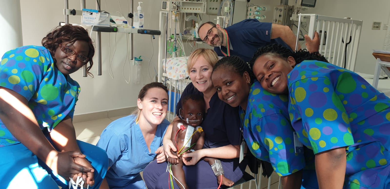
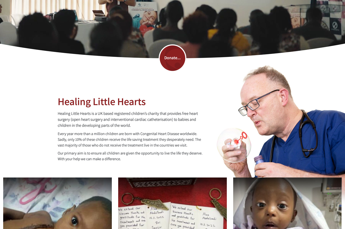
Healing Little Hearts was founded in 2007 after a group of heart specialists realised that CHD (Congenital Heart Disease) was affecting the lives of thousands of children worldwide. CHD is an umbrella term that covers all heart defects in the structure of a heart that are present at birth and its effects can range from a significant lowering of a child’s quality of life to being fatal.
CHD affects 1% of all children worldwide and can often be completely cured with surgery if it is done in time. However, the cost of an operation is huge and, in countries which don’t have an NHS-style health system (90% of cases), it’s simply not an option for parents.
Healing Little Hearts gathers together teams of surgeons, nurses, etc. who travel to a specific country and set up a “camp”. A camp is usually based around a specific local hospital, but children from anywhere in the country can travel to receive free operations.
The operations, travel and accommodation are totally funded by the charity, and the team work for free by synchronising their annual leave. Over 2,300 operations have been performed by HLHs sin 2007 in sixteen countries.
HLH needed a website that could be quickly updated with the fast-moving news and daily reports for their camps to get across the scope of their work. Other requirements were to be able to take online donations, encourage volunteering and a merchandise shop to raise further funds. The full list:
Every country HLH visits is listed on the site on an interactive map, and every camp completed has a photo or video gallery.

We made heavy use of WordPress’ custom post types to allow us to segment different yes of information, but also mix them together. For example, a Country post will also automatically detect News posts and Story posts which mention that country and display links to them at the end. Doing it like this means the site pages become interlinked and allows viewers to follow different trails, or to browse in a more traditional way if they are looking for a specific piece of information.
WordPress’ Gutenberg setup was also very useful in allowing us to create custom content blocks to make updating the site faster and less of a chore, and we used WooCommerce to run the merchandise shop.
We took some time to archive HLH’s previous camps and present them on the site so it wouldn’t be empty on launch. This is an ongoing project and we will be going further backwards in time as older camp diaries and memories are rediscovered from the pre-social media, pre-smartphone days! Even so, we launched with over 1,200 images of nearly 50 completed camps!
A vital part of the site is the stories. Rather than just case studies, the stories put into sharp focus the anguish of families who know they have a sick child but can’t find the help they need and the joy of seeing them cured. As well as being collected together, these stories can be inserted into other pages and posts as modules to bring a flash of reality into an article or help to increase donations.
Whilst we could never claim to be doing such worthwhile work as the Healing Little Hearts team we’re proud to be a part of helping them carry on doing it.

Sensoria Festival Website with Shop, News and Events.
We have been working with Sheffield’s festival of music, film and digital art for a long time. They were one of the first clients to make use of the WordPress platform and have stuck with it ever since.
With the festival sector hit hard by ongoing COVID restrictions, an online presence was even more important than ever and Sensoria decided to take the opportunity to get their website up-to-date and in good shape to present the year’s redesigned programme of events.
2021’s update was done in conjunction with Michael Eden, Sensoria’s designer, who provided with visuals and a style guide that we built into a bespoke WordPress theme.
We made good use of the new Gutenberg technology to give Sensoria much more control over their content than they have ever had before with some custom-built content blocks. We rebuilt the Events area (a crucial part of the site) from scratch to allow all past events to be viewed for posterity, whilst keeping the current ones at the forefront.
The site also has a customised WooCommerce-powered merchandise shop.
New brand and website for Sheffield recording studio and social enterprise
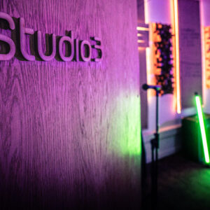
Hybrid 3 is a social enterprise which blends a fully-fledged professional recording studio complex with educational and arts projects. Their amazingly well-equipped recording studios, rehearsal rooms and audio production facilities are the go-to place for Sheffield’s musicians, but Hybrid3 also has a passion for developing local talent and providing community education…everybody deserves the chance to be heard!
Our task was to come up with a brand which covered the overall concept but also emphasised the two distinct halves of Hybrid3 which sometimes work apart and sometimes together. Then our concept would be tested fully by design and building a single website which did the job of the two previous, separate sites which had grown up around the two arms of the organisation.
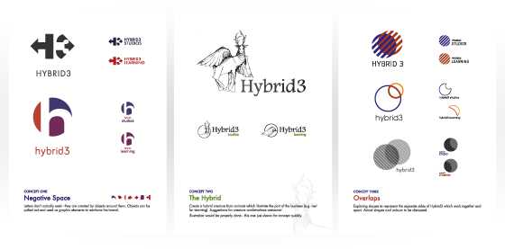


 After a fascinating series of ideas and concepts, we came up with a colour scheme and set of shapes which we worked into a brand for Hybrid3 (the overall organisation), Hybrid3 Pro (the music studios) and Hybrid Play (the educational side).
The colours of the main logo match the architecture and decor of the building, whilst the sub-logos are a single colour but echo the shapes of the main. This colour scheme becomes important on the website…
As Hybrid3 were familiar with WordPress, we decided it would speed things up and reduce the learning curve to use that as the content management system. We added WooCommerce for the merchandise shop and used a few custom-built Gutenberg blocks to give them a toolbox of pre-built elements they could draw on to quickly build new content.
Imagery was very important and the selection of large header photos and videos used were chosen especially for their colour and style, all supporting the brand.
The site needed to appeal to professional bands and musicians as well as educators and community groups. There was the danger that the style of a slick, cool, exclusive recording studio website mixed with a friendly, happy community site would jar badly and we needed to make sure both extremes met in the middle without compromising either. During the branding and site build, the one word which spanned over all of the parts of the business was “inspiration”. We needed to inspire people to create, whatever the reason they were at Hybrid3 and whatever their background or aspirations.
Video and large photos of real people actually creating and enjoying themselves in the Hybrid3 studios were a must, and formed a major part of the look of the site. Also, embeds from SoundCloud let visitors hear what is being made by Hybrid3’s users, so there is a feel of a working and busy organisation.
A recording studio is all about sound, so we also enabled the use of embeds from Soundcloud to showcase the huge range of work that is produced at Hybrid3.
Navigation-wise, the Pro and Play areas needed to both belong to the main site to avoid a confusing journey around the site, but also have a distinct feel of their own. There is a high chance that a visitor to the Pro area will never look at the Play area (or vice versa), so we needed to have common areas as well. Clever use of colour and content along with the specially commissioned copy also added to the uniform vs. separate feel we were trying to get across the site.
Hybrid3 work with the BBC and other arts organisations and it was important to show this to enhance the reputation of the studios.

Due to COVID-19, the studio was closed during much of the design and build work. Hybrid3 used this time to their advantage, being able to concentrate on a project which would have normally been interrupted by the day-to-day running of a business. This gave us the time to get all aspects of the site just right for a December 2020 soft launch, building momentum as the studios gear up to reopen at the start of 2021.

Delve into the family tree of Sheffield Music with this animated, interactive history and archive!
Uncommon People is a project which aims to map the family tree of Sheffield music.
Launched in 2009 the site was a groundbreaking piece of research, design, UI and programming. Unfortunately the 3D interface was made using Adobe Flash, the then all-powerful web graphics and animation package.
As Flash’s requirements became more greedy and its popularity dwindled, the site became less land less useable. Apple refused to support it on their newly launched iPhones and iPads which eventually led to Adobe finally dropping Flash completely.
The Flash issue coupled with the lack of mobile support meant the site needed rebuilding from scratch using open-source and future-proof technology. We went for standard HTML5, CSS and JavaScript and set about taking the massive amount of data the site had collected and visualising it in a useable way.
The keystone of the site had always been a three-dimensional family tree, or a web-like structure which mapped each artist to all of the bands they had been members of. As Sheffield bands have a habit of sharing musicians or setting up numerous side-projects, the web can get quite tangled. Our JavaScript solution made sure the bands, artists and connections stayed connected but far enough apart to be visible. The user can pan and zoom, or home in on a particular band or artist to concentrate on their own connections.
As well as the family tree interface, the same data is used on two other sections of the site in different ways to provide a visual history of Sheffield music and also a text-based browser for quick research.
The site has grown to the size it is through user contributions, so that functionality was streamlined to make adding and moderating new content less laborious.
The project belongs to the Sensoria Festival (whose website we also built and maintain) and we worked closely with them and their designer Michael Eden to bring Uncommon People’s look right up-to-date at the same time as the intenbal workings.
Best of all, it now works on all phones and tablets!
Website with configurable content toolbox.
As we share a building with Azzure IT, it was inevitable that the time would eventually come for us to tackle their website. A new marketing team and a general look at the company’s communications made it the ideal time.
As a Microsoft Gold partner, Azzure IT have a wide range of products and services all of which need to be researched by potential buyers. The site has a lot to do in terms of presenting technical and commercial information to business users, but at the same time, needs to promote Azzure IT’s friendly, trustworthy approach.
We tackled the design of the site in a slightly different way. We set up a style guide – a basic set of rules of what to do (and what not to do) along with a toolbox of fonts colours and different kinds of pre-styled content areas to get different kinds of information across. We then left it up to Azzure IT to add their copy using the tools we had provided, after which we went back and tidied up any loose ends. Along the way we discovered that we needed different ways of presenting and differentiating certain types of information and, because of the modular design, we were easily able to add new elements to fit in with the existing layouts. This organic approach doesn’t work with all clients, but the proximity of the two teams made it easy to keep track of progress on both sides.
The previous site was built in WordPress and we were happy to continue using that – partly to make it easier to move the existing content over – but mainly because of its powerful new Gutenberg block system which allowed us to build the bespoke content areas that the admins could add anywhere on the site. This kind of flexibility had been possible in the past, but it required cumbersome and difficult-to-manage “site builder” plugins to be installed. Because of this approach, the site has an arsenal of video areas, slideshows, animated tabbed panels, comparison tables and layout blocks available.
One of the challenges was that the previous Azzure IT site had been heavily optimised and scored well with search engines. We didn’t want to lose that, so a lot of the content needed to be taken over from the old site. We were able to create export and import routines to speed this process up to save days of manual copying and pasting.
Using another of WordPress’s features, Custom Post Types, we were also able to make Case Studies, Courses and Resources sections much easier to navigate for the site visitors and for the admins to keep up with.
Websites should always grow and evolve and we know this is only stage one – Azzure IT have plans for the future. The praise we have received so far from both Azzure IT and their customers, coupled with the fact the site is so easy to update, means we are already working towards stage two! We’ll keep you posted…
Brand and Website Rebuild

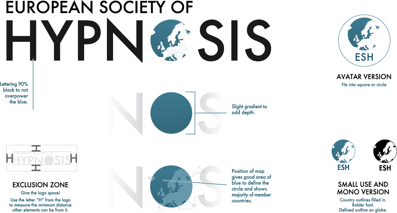
Whenever we mention that we work with hypnotists, there are always plenty of smart comments about our minds being controlled, or being mesmerised into working for free. And this is a problem with hypnosis in general – the entertainment, comedy stage hypnosis most people think of first overpowers the role hypnosis plays in healthcare.
The European Society of Hypnosis comprises of medical professionals who use hypnosis in their work as psychologists, psychotherapists, dentistry and other medicine. The society is, in fact, a society of societies. Each country has at least on organisation for medical hypnosis and the ESH brings all of these 45 separate European societies into one in order to share research and promote the highest professional standards across Europe.
Or task was twofold:
It’s an old cliché that a racehorse designed by committee is a camel – i.e. when too many people have input on a project, the result of adding all of their good ideas together becomes not a sum of all of the best parts but a disjointed, ugly hybrid. The ESH is a committee made up subcommittees of members of other committees! On top of that, each member of the board is from a different country and culture and speaks a different language. It’s well known that different countries and cultures have wildly different ideas about what looks good – even the same colour can represent life in one country and death in another. We needed to focus on the horse!
Rather than entering into the cycle of coming up with hundreds of brand options, inviting comments, refining and asking again, we decided we needed to keep a tight control on the process but, at the same time, make all the members feel like they were part of it. So we spent more time talking and writing before moving onto any design. The one thing that was unanimous was that we should steer away from spirals, concentric circles, eyes, etc. – all the done-to-death imagery associated with hypnosis. It was clear that a European map was high on everybody’s list. The other thing which helped was the the ESH has adopted English as its official language, so we were able to use a typographical approach when it came to the logo. Finally, everybody agreed that they didn’t want to move too far from their old look and there must be some nod back to the origins of the society.
The most important breakthrough came when we decided we were branding a society not hypnosis itself. It freed us from the problems with hypnosis gimmickry we had already identified. We also spoke a lot about what our idea of “European” was. A task made all the more challenging by the fact that Brexit was rumbling on and becoming ever more toxic. Even a reshuffle in the society’s top tier of leadership didn’t derail us.
We went for a limited palette of dark turquoise, dark grey and light grey. These colours looked trustworthy, clean and professional whenever we tried them out on print and web applications.
We thought Futura was a great choice for ESH as it’s a classic with very European influences. The sharpness of the “N”s and “Z”s along with the precise, geometry of the curves gives a scientific feel but with the elegance of signs you might see at a European art gallery. It also has a good set of weights which make it quite flexible for layouts and copy.
The existing logo had been around for over twenty years. Our issues with it were:
The thought process:
The website brief was simply a continuation of the same concepts covered in the branding: professional, gimmick-free, trustworthy and clean.
The site needed to do the following:
To the brief we added the need for:
The site has a large page count and we spent some time categorising and organising the information to make everything easier to find. To get to these pages, the navigation had to be undaunting and simple despite the number of links. We went for “megamenu”-style dropdowns backed up with lower “related pages” shortcuts where needed. This also helped the site to work well on mobile devices, unlike the previous site which had been built before the advent of smartphones and tablets.
We had already enforced a strict brand guide as a lot of ESH’s output is produced by different people in different places. This had led to serious inconsistencies in the way their documents, newsletters and other communications had looked in the past, with members often going off in their own direction. Even the regular newsletter struggled to keep to the same look from one issue to the next. It was important, therefore, to work to a set of rules ourselves as we were creating the site and to then pass those rules over to the ESH when it was time for them to take back the running of the site.
The site needed some large pictures and we decided to use a full-background approach, with imagery covering the entire page. The page content was pushed down to reveal the top part of each background image and the rest fell behind the content. This meant that the choice of photographs was important, so we set the following criteria for ourselves, and then the ESH for future updates:
The images we picked were a combination of originals from our own library and some from relatively obscure stock sites which matched the criteria.
The original site used WordPress and the ESH wanted to continue with this as their staff are used to updating the site.
A brand-new addition was a user-only area which allows members to have their own profile and home page to share information, their own publications and promote collaborations and contributions to their research from other members.
“A breath of fresh air.”
“A major step forward.”
“A fantastic job. Well done!”
Timber frame manufactures, suppliers and housebuilders.

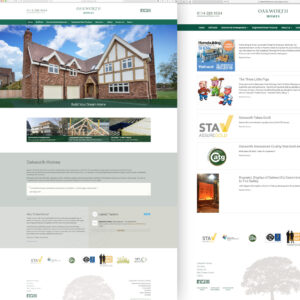
Oakworth Homes with with architects, designers and builders to provide timber frames and other parts for housebuilding. They had been struggling with their “old-school” website for a number of years. Built in a previous generation the site relied on Flash, was not mobile-friendly and had to be updated by the developer. The site’s performance on search engines was also suffering from its outdatedness and lack of fresh content.
The website was causing confusion because Oakworth had rebranded but had been unable to update the look of the old site to match their new focus on dealing with the public as well as trade.
We came up with a number of suggestions, the main being that we use WordPress as the content management system. Despite WordPress’ merits (which are discussed all over this site) Oakworth’s marketing manager was already familiar with the system and so could take over the updating of the site easily.
The look and feel of the site had to mirror Oakworth’s brand which is clean and precise but also feels natural. Oakworth use sustainable, natural materials but are also a precision, standards-led engineering company so the look of the site needed to show both, whilst being attractive to housebuilding contractors and architects right down to single customers building their own home.
Oakworth has a story and heritage so we made sure there was an area on the site for the founder, John Capper, to tell that story.
Other suggestions we made were:
The bespoke WordPress theme we built allowed several different page layouts which could be selected to give different emphasis on content: some have full-page background images, some slideshows and some just a solid colour. The overall layout is simple and clean, letting the content speak for itself.

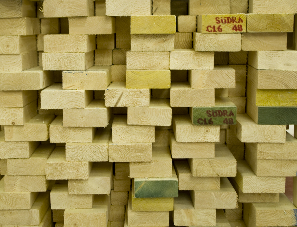

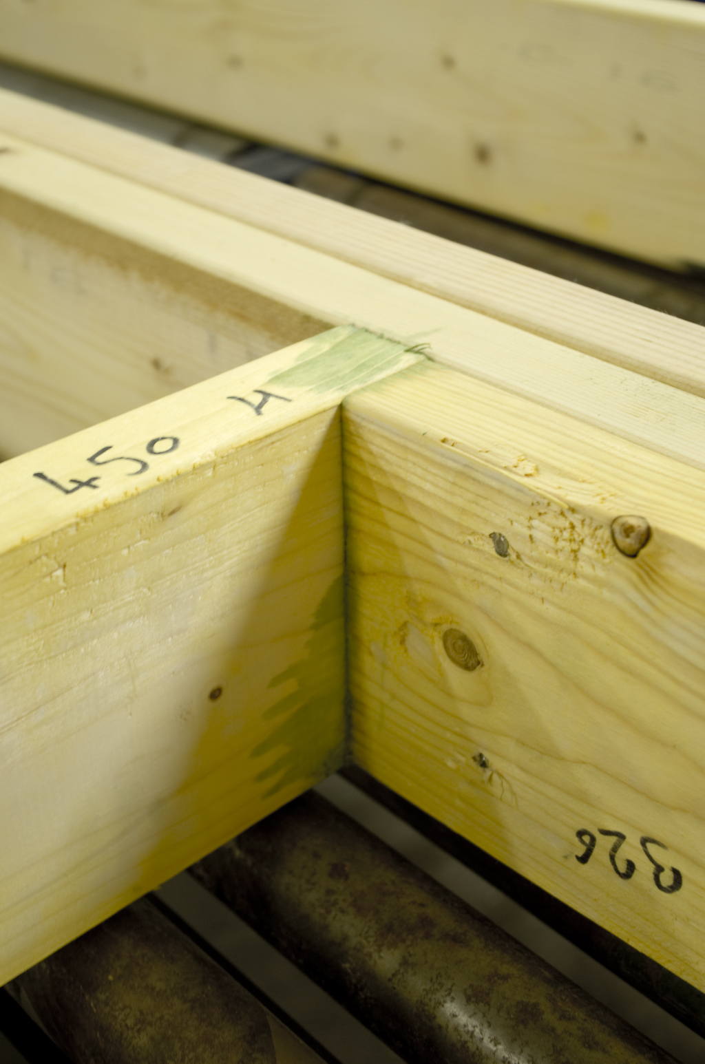
It was important that all images of products and processes should show the customer exactly what they might be purchasing, so we did a photoshoot at the company’s headquarters in Sheffield. This created a large library of images which can be used in rotation on the site to keep it fresh.
Oakworth now have a website they can update at will. Whereas before, the website had been left to languish because of the difficulties in updating it, it is now kept fresh and has become the main marketing tool for the company.
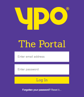
Self-service purchasing portal for customers.

The Yorkshire Purchasing Organisation was formed in 1974 by thirteen local authorities to aggregate demand and improve purchasing efficiency as a buying group. It allowed multiple organisations to “club together” to combine their purchases into single, larger orders to make substantial savings by bulk buying.
As a group, YPO supplies products and services to schools, local authorities, charities, emergency services, the public sector and other businesses such as nurseries and care homes. Their range includes around 30,000 products and services from pens and paper, computers and furniture to things like electricity, food and insurance.
With so many products and orders to keep track of, YPO need a massive sales, inventory, warehousing and logistics system. Our sister company, Azzure IT, have been working with YPO on a long-term basis to integrate all of their systems and processes into a single solution. As a result, a highly customised deployment of Microsoft Dynamics NAV is now at the heart of the business. YPO wanted to extend the use of their new system to all of their members rather than just the staff at HQ with a simple, quick-to-learn solution which allowed the members to do only what they needed to do and hid all of the rest of the functionality.
Whilst the NAV system was perfect for YPO, they needed their members to be able to place their own orders onto the system, check their progress and, if needed, edit them. Just giving customers access to their internal systems was not an option, so our task was to create a web-based interface which allows external users to access and modify orders from NAV but using a website.
YPO has a very strong and recognisable brand. As the portal is an extension of YPO’s brand into other businesses it needed to be consistent with all of YPO’s other messaging, so we worked closely with their marketing team to ensure this.
The user interface is accessed through any web browser (desktop or mobile), is simple, clean and designed to need the minimal amount of training for users.
Our aim was that if a user can navigate a website or use Word, then they will already know how to operate all of the elements. The small amount of training needed related mostly to the setting up of accounts and users.
YPO can allow a member to access whatever parts of the NAV system they need. Once the member is set up, they can also allow other users (usually their employees) to also use the system, but with more limited options. The power to add sub-users gives the portal another lever of self-service, as YPO do not need to manage individual users.
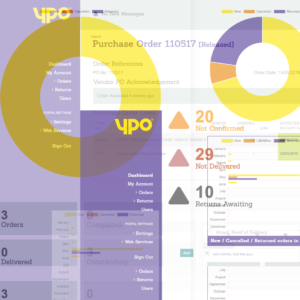
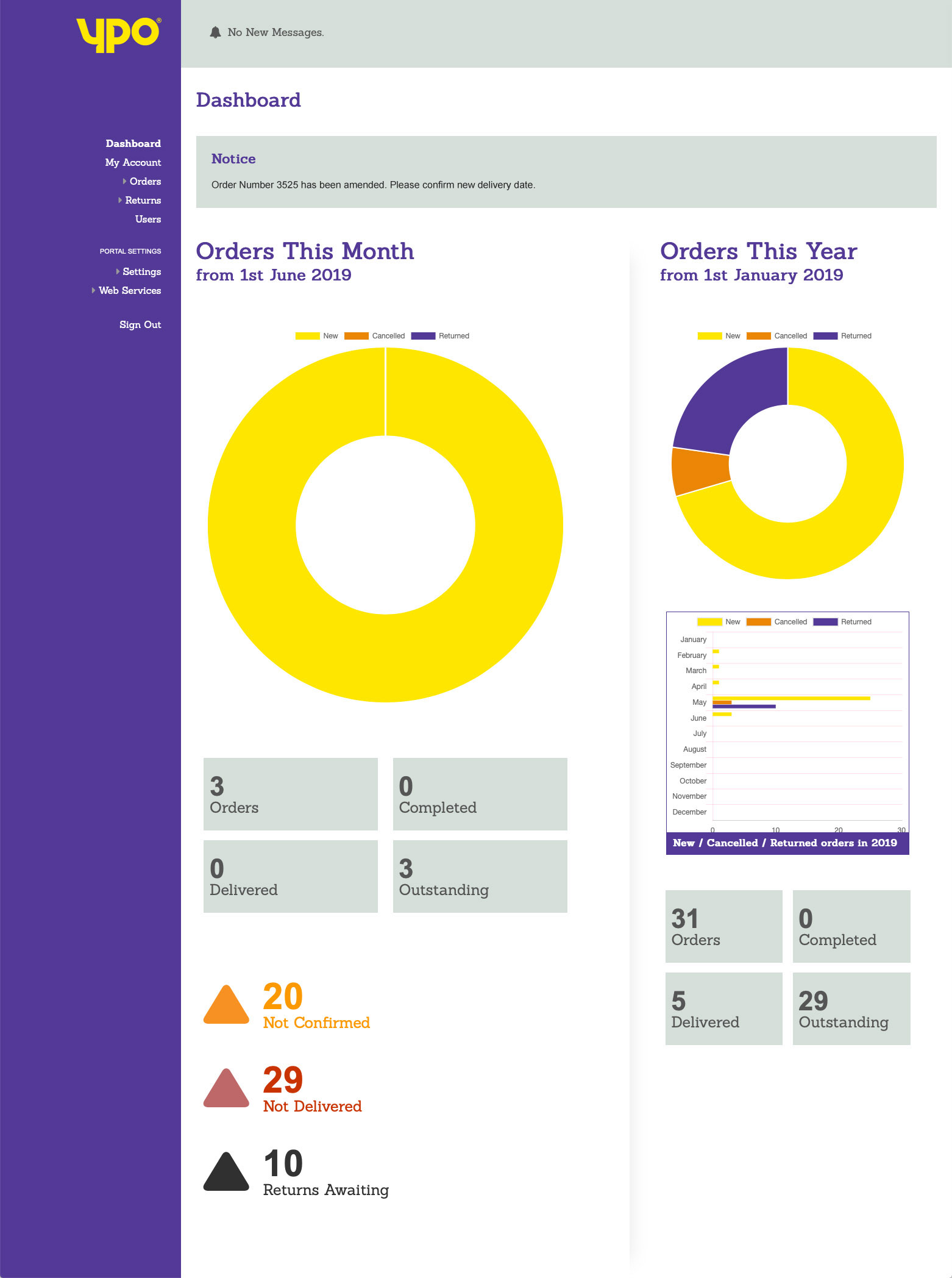
Users are met with a dashboard when they log in which gives the latest sales information and any warnings of actions which may need to be taken. The actual data shown on the dashboard depends on the type of user they are, with the higher levels of user being able seeing more sensitive data than the lower ones. Any messages from YPO are also shown on login.
Existing orders can be filtered by their status (in progress, new, updated, cancelled) and each order can be inspected in detail. The detailed view shows the status of all of the lines of an order and allows changes to be made to quantities and delivery dates. If something has changed on the YPO side, such as a delivery time, the user is warned and they get the chance to accept the change, or propose an alternative.
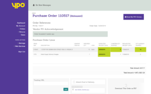
When an order is out for delivery, a tracking URL can be added if the carrier offers one. When delivered, any proof of delivery documents can be uploaded to the order. There is also an email enquiry button which can send a message directly to the account handler associated with that particular order if there is a query.
Different users have different ways of using the order information internally, so we gave them a few choices. Every change to an order generates an email alert but some users wanted messages to be sent as the changes occur whilst some didn’t want to be inundated with updates. It was also found that some users had a specific time of the day set aside for dealing with orders…so we gave them a choice to have constant email updates or to store messages up and deliver them as a single block which could be scheduled to arrive at their preferred time of day. Any order can also be downloaded as a PDF document from the system if users need backup copies or to print them as a formatted A4 document.
Orders which need to be returned can also be dealt with by the portal as Purchase Return Orders, which are operated the same way as orders, but work in reverse.
In addition to the order process, users can administer their account (change passwords, etc.) and also decide the frequency of their email updates. Higher level users can control access to the portal which the lower levels are allowed.
YPO’s customers can now oversee and control their purchasing and returns operation without the need to contact YPO which means large time (and therefore cost) savings on both sides. Orders can now be placed or edited outside of working hours, if needed, as YPO is no longer needed to be involved in the process. The mix of automation and self-service has taken a huge burden away from YPO’s staff and the portal is an extension of YPO’s brand into their customers’ operations.
YPO’s customers now feel that they have more control over the process and that their relationship is more of a partnership than before, as they are all working with the same system. The simplicity of using a website with familiar controls made onboarding the users a simple task.
Market-disrupting branding and packaging design!


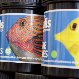
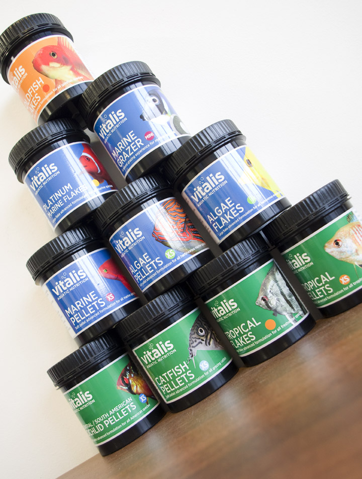
After spending a long time working with World Feeds getting their corporate brand perfect we moved on to their key brand Vitalis. Vitalis is a range of aquatic feeds which is aimed at expert amateur and domestic fishkeepers and professional aquarists. It is used at home or on a large scale in aquariums.
A lot of the Vitalis brand development work was geared towards packaging as this is where the brand is used and seen most. This meant that by the time we were ready to produce the actual packaging we had a pretty good idea of where it was going.
Vitalis is divided into products for coldwater, marine and tropical species, so we needed to differentiate clearly between the three areas, whilst also pulling them all together with the distinctive and consistent Vitalis brand. The base colour of the label (orange, blue or green) does this instantly. Each of the three product groups contains several products aimed at specific fish or aquatic species, which are illustrated with a large, bright, closeup photograph of the species and also a coloured dot. The dot serves a dual purpose on some products: for flakes it is simply a coloured dot, but for pellets the diameter of the pellet is shown inside it. The colour of the dot is carried through into product marketing material and datasheets.
The pot needed to work alone as some retailers would only sell one kind of product. It is also common for aquarium retailers and garden centres to have separate areas for cold water, marine and tropical fish which means the products could be displayed apart from each other. At the same time, smaller stores could have a “Vitalis” section with all of the products displayed together, so the pots also needed to look good when sat next to each other. The main brief was to make the packs look completely different to competitors offerings and elevate the Vitalis brand.
The solidly coloured and uncluttered labels set off by the deep black of the pot behind goes completely against the style of most other fish products, which tend to look amateurish and hobbyist. Vitalis positions itself as slightly more expensive than other brands but with scientifically proven advantages. The packaging needed to convey Vitalis’s scientific credentials but also a confident, attractive retail-friendly product which could appeal to any fish owner.
Food labelling is governed by several laws and the restrictions on the information and size of type are almost endless. With pet food, there are often more regulations than with human food. The challenge for us was to make the rear of the label as friendly and informative as possible whilst including all of the statutory information, recycling information, a space for the factory to stamp a batch number and a big ugly barcode…all whilst keeping the text at a legally readable size! Luckily we have a long experience in food packaging and just a top-up on the regulations was all that was required to make sure the labels passed the required tests.
As the full ingredients and amounts of each ingredient must be shown for this kind of food product, a typographical challenge ensued as some of them have some very long names. However we had already anticipated this during the brand development and chosen a font which had several variants, some of which were condensed but still very legible.
The final challenge was what’s known as “coning”. The pots the labels are on do not have straight sides (this is because they would be impossible to remove from the mould during production). The pot’s bottom diameter is approximately 1mm smaller than the top. Whilst this may not sound significant, if you were to produce a rectangular strip label which wrapped around the pot, by the time you had wrapped it all the way round, the edges wouldn’t line up. Imagine a screw thread on a bottle – the threads is at a slight angle and carries on up the bottle, never meeting its opposite end as it makes a full circuit.
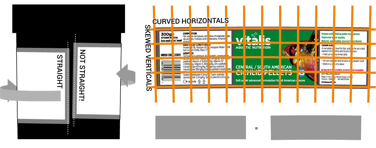
The way to combat this is partly maths (you use the top and bottom diameter and the angle that’s created by the difference between them by the height), a bit of trial an error (making mockups) and experience. The end result is that whilst appearing to be a rectangular strip which wraps round the pot, each label is actually a kind of rainbow shape with angles ends. When making the artwork it’s necessary to warp and skew the contents of the label to match the curve and angles and the nearer the ends of the label you are, the more distortion you have to add to compensate for the shape change when it gets into three dimensions on the pot.
Again, experience in packaging and 3D design ensured these potential nightmares were was taken into account from the beginning and part of the reason the labels look like they do is because we designed them to be easy to edit, even when the lines of text aren’t straight.
Once the packs went into production, a pot from every range was delivered back to us where the task of photographing them all for the website began…
The story didn’t end with the production of the packs – we then had to get Spanish, Dutch, German, French, Italian, Portuguese and Turkish translations of all of the label copy and make full sets for each language. Our choice of font once again saved us as some languages seem to use much longer words and need far more space than others to say the same thing (dich ansehen, Deutschland!).
In all we designed and produced artwork for over 700 labels over the course of three months…and Andy’s goldfish got pretty fat on all the free samples.
A system for selling and supporting Microsoft Dynamics 365 products.


Used by more than four million small to medium-sized business, Microsoft Dynamics 365 connects data, people and processes. d365Now is Azzure IT’s concept for selling and supporting Dynamics 365.
Dynamics 365 is a subscription-based system which also allows customers to add extra modules as their business grows. This is traditionally done via a Microsoft partner but Azzure IT were eager to allow customers to administer their own packages and payments, but to also be able to use the system internally to help customers who still need Azzure’s help.
A second strand to the project was that the whole system could be duplicated, rebranded and used by chosen partners of Azzure IT to enable partners to sell the same products and services as agents.
D365Now is new venture but one which depends heavily on a partnership between Azzure IT and Microsoft. We needed to create something which could take advantage of the familiarity of both companies’ brands but also had its own character. We chose a colour palette of blues and light greys across the site and the symbols and imagery are designed as an extension to Microsoft’s own.
Based on research of the sector D365Now is aimed at, we opted for a simple wordmark rather than any kind of symbol.
![]()
We used the old Microsoft favourite Segoe UI Light for the logotype with a few of our own tweaks.
The system uses a customer’s existing Microsoft account to allow fast signups and purchases. If a customer doesn’t have an account the system takes them through the process to set one up. Using a Microsoft account minimises time filling in forms as d365Now can interrogate the account for the details it needs. It also makes it easy to assign licences and official support packages.
Once signed up, customers can easily pick what products they need and subscribe using a credit card. The system automatically gives a free trial and then charges the customer on a recurring basis after one month. Customers can add new products whenever they need or add more licences to products they already subscribe to – payments are automatically calculated and adjusted.
Customers can also choose their own level of support, with different packages available designed for users of different experience of the products.
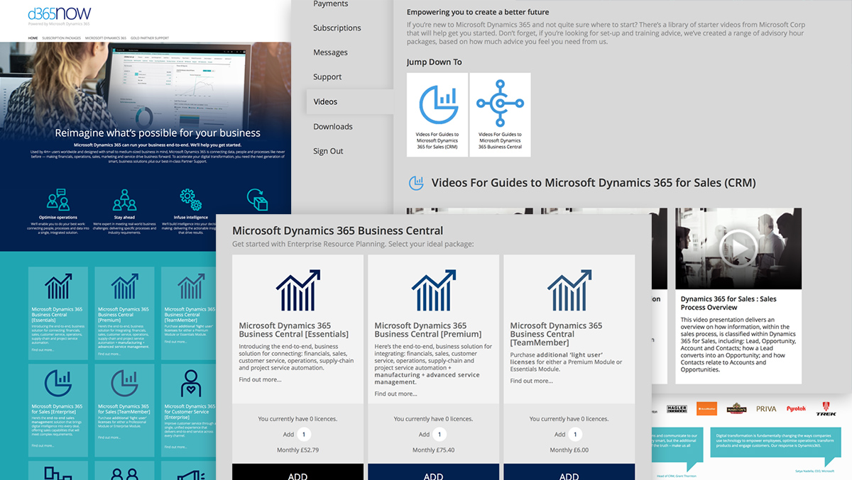
Each user’s account area also has downloadable help resources and a video library as well as a messaging system to allow Azzure IT to broadcast information to all users.
An automated system ensures customers are notified by email on purchase, updates and any other important issues about their account.
Azzure IT can create a branded clone of the system to enable any of their partners or agents to run themselves. The partner’s website looks the same at the base site but is branded with their own logo. Sales go through the site to Azzure, who also provide all of the support. The partner site runs itself and receives all messages and product updates direct from Azzure. This means the partner has minimal work to do to maintain the site and can concentrate on marketing it.
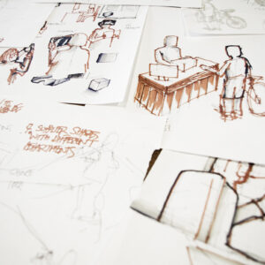
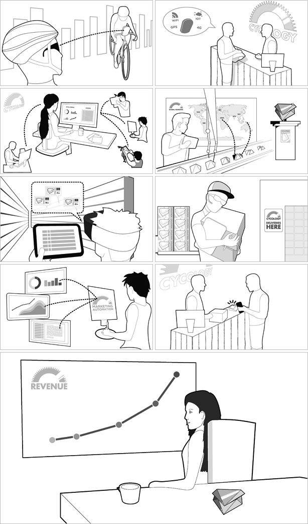
Storyboarding and production of a set of illustrations for keynote speech.
Azzure IT needed some background images for a keynote speech on the digital revolution in business.
In an attempt to avoid the usual stock imagery we decided some crisp line-drawings would illustrate the points of each slide better. Being custom-drawn, we were able to provide the exact image required rather than having to compromise and find the nearest stock match.
Without the limitations of having to source images we were able, not only to keep the style consistent across all slides, but to link all the illustrations and have a story running through them which began with a product enquiry, covered the development, design, manufacture, marketing and delivery of a product back to the customer who originally made the enquiry.
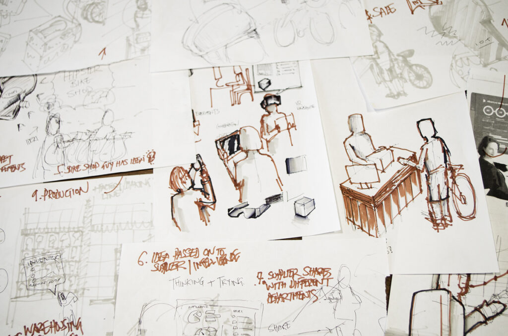
The sketches and storyboard were done by hand, with the final illustrations produced as vectors.
Concepts, design and execution of a targeted marketing pack.

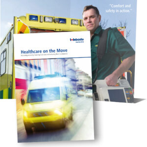
Webasto have been providing heating and cooling solutions for vehicles since 1901 and are worldwide brand. As part of their drive to appeal to the UK public sector were asked to come up with concepts for a pack which could be mailed to managers of NHS ambulance fleets.
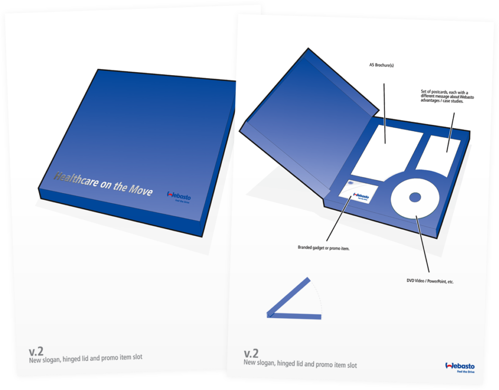
As well as their existing promotional DVD and business card, Webasto wanted to include a set of postcards which detailed their specific services and products as well as a colour brochure targeted specifically at the “Blue Light” sector which we designed and print-managed.
Webasto needed an item which was of a quality high enough to be retained by the recipient, yet was cost-effective to produce. As they already had some promotional material to add to the pack, and we were creating the rest we knew the sizes required.
We wanted something three-dimensional and managed to find a printer who could supply an off-the shelf box pattern which we could customise with colour, brand and a our own insert to securely hold the contents during postage.
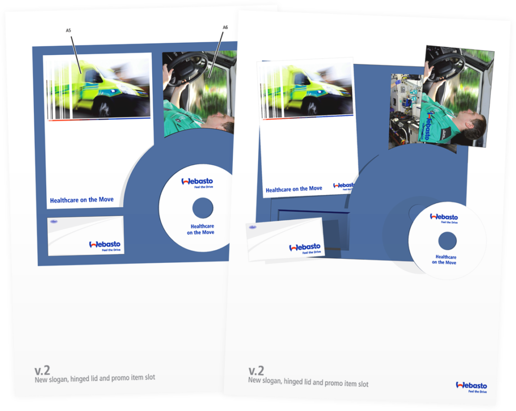
Our postcards and brochure were designed to appeal specifically to the sector as this was a highly targeted marketing campaign. Our main challenge was finding suitable imagery. Webasto has a large range of imagery but, being a German company, most of the vehicles in their photo library were left-hand drive models. Also, every country has a distinctive look for their ambulances and most of them were obviously not from the UK. This meant we needed to source original and stock images for the brochure.
The copy supplied by Webasto was quite generic and taken from previous literature, so one of our tasks was to refocus and rewrite the content to appeal specifically to the UK NHS ambulance sector.
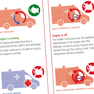
A number of infographics were also needed to illustrate the concepts of Webasto’s “Engine-off” heating technology.
A visual and functional update to a unique piece of Sheffield’s history.

The Garrison Hotel is a well-known Sheffield landmark. The historic Hillsborough Barracks, originally built in 1854, has undergone many changes of identity but in 2001, the former accommodation and Guardhouse areas were converted into a hotel, bar and restaurant.
Whilst the website for the hotel had done a good job for many years, the advances in technology and tastes meant it was time for an update.
After many discussions and research we came decided a list of key points:
Behind the scenes we needed to make the site easier to update and to improve its search engine ranking.
Early on, we recommended moving over to WordPress as the system for managing content. On top of this we added several customised functionality including an events manager, photo galleries, booking system and ways of making the different areas distinctive in their own right whilst keeping a consistent look.
The hotel is very photogenic and we wanted to make photographs the main feature of the site, so a lot of work was done to let the hotel take advantage of their existing library of images. New photographs were also shot especially for the relaunch.
Word-of-mouth is a major factor in the hotel’s success and social media and links from other sites play a large role. Social sharing and TripAdvisor integration was important, as we realised the website was only one part of the hotel’s online presence wit all needing to work together.
Search engine optimisation can be controlled from within the site admin area on a per-page basis.
Staff at the Garrison now look forward to updating the site and are easily able to add new content – especially photographs. The ever-changing content is helping keep the site fresh and attractive to search engines.
New menus and events can be easily distributed to customers.
Bookings online have begun to take an upturn as the new design gains traction.
Re-energise marketing efforts with a new website.

Coverworld manufacture and deliver metal cladding and panelling for contractors and smaller builders in a wide range of sectors. They came to us because their website was over ten years old, had outdated information, looked terrible and was impossible for Coverworld to update themselves. They had recently rebranded but were unable to carry the branding across the website, making it look even more out-of-place.
They were answering the same queries about product spec. all day and posting out printed datasheets which were constantly needing to be updated. They needed to show:
We proposed a customised WordPress site which, whilst allowing the expected page and news updates had extra capabilities added:
Coverworld have their entire product range on the website and it has become an invaluable repository for all of their product data. Their own staff use it as well as their customers.
The site is kept up-to-date with regular refreshes of the product line. The staff find it simple to add or amend products in the CMS as a lot of the process can be done quickly by ticking boxes or picking menu items rather than typing data in.
The site is a valuable resource as it not only shows Coverworld’s own product range and specifications but has up-to-date information on the latest building regulations, safety legislation and maintenance requirements when using cladding and roofing products.
Dynamics NAV Integration for communication between internal systems and the public.

SPS create, design, manufacture and deliver promotional items. They are the UK’s biggest supplier of customised merchandise. If you have ever had pens printed with your logo, a branded plastic bag or a customised mug, the company who supplied it probably got them from SPS.
Having their own production facility gives SPS the freedom to design and produce almost anything they can think of. The usual pens and mugs are just the tip of the iceberg – they can do embroidery, customised books, glassware, food, electronic items and even totally custom-shaped items such as magnets and rulers.
SPS’s business model is to not supply to the end-user but to a network of resellers across Europe who then sell to business. SPS offer these resellers a package which includes credit facilities, delivery, marketing support and a website.
SPS were in the throes of completely updating the system which runs the entire business (stock control, delivery, accounting, production, purchasing, quoting…everything) with Azzure IT. The new system is based around a bespoke version of Microsoft Dynamics NAV. Azzure asked us to come up with a web-based control system which allowed SPS’s internal sales staff to get quotes easily out of the system and to update product information without having to become NAV experts. The customer-facing part of the website needed to present all of their products and allow users to get their own quotes for products. The other major requirements were:
Making intensive use of NAV’s WebServices we were able to get a very high level of communication between the system and our new ecommerce, CMS website. The way NAV presents its data, coupled with the outdated functionality of the existing website made a complete rebuild and redesign of the existing SPS website necessary.
A major design challenge was making the site responsive to mobile devices, bearing in mind the large amount of data that was needed to be displayed and the interactivity required.
We also created “The Quote Machine”,which is the heart of the website. It allows anybody to test out different quantities and style combinations of an SPS product and see the effects on price. It also suggests different quantities to what have been requested if that would make the quote more efficient by taking into account factors such as production methods or delivery options which the customer would not be aware of.
Quotes can be saved in a basket for later use, or shared to customers by email or social media.
If an SPS reseller wants to have their own website rather than referring to the SPS site for quotes, this can be done at the push of a button on any chosen domain. A reseller has a choice of two layouts, each of which can be further customised with their branding, which includes their colour scheme, logos and fonts and header images. Some of the pages, such as “About Us” are editable by the owner and some remain under the control of SPS so they can remain in charge of product images and pricing. SPS can also add updates such as “special offer” banners when needed. In this way the reseller can sit back and let SPS do the hard work (product and pricing management, providing quotes) and concentrate on selling the products. These sites come pre-filled with content and are ready to go live, even if the owner makes no changes. The system will allow further layouts to be added in the future to eventually build up a collection of designs.
SPS have now been acquired by PF Concept and the UK website is no longer visible. We have left the case study as the system is still in use internally.
Online store and style gallery.

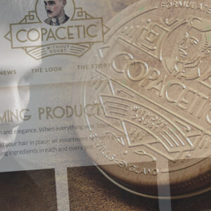
“Copacetic” is a positive word, made popular in the smoky jazz clubs of 1920s and 30s America. It means “in excellent order”, “completely satisfactory”, “sorted”. A Copacetic Gent is someone who gets it right every time – especially with their style. He makes great efforts to look perfect…whilst seeming to make none at all.
Savills Barbers of Sheffield is famous worldwide for being a time-warp back to the 1930s where gentlemen’s barbers were respected craftspeople and confidants. A personal and individual service to each customer was key and copaceticness abounded. Savills attitude, look and style all combine to give an experience unlike any other but they found that the current selection of styling products they were using didn’t quite fit in with their ethos…they were just not Copacetic enough. So they decided to invent their own! The Copacetic Gentlemen’s Grooming brand was born and was soon developing paste, wax, pomade and other mysterious substances which we didn’t even know were a thing.
Copacetic Gentlemen’s products (as well as equipment such as combs, scissors and aprons) were initially used only in Savills and sold to their own customers, but it soon became clear that other like-minded barbers around the world were in similar need – so the range was made available to them as well, in distinctively branded packaging. Copacetic products were sold to barbers for their own use but they were also selling them on to their own customers, as Savills themselves had been doing. As sales increased Savills decided to start selling the Copacetic range online and a website was commissioned.
Unfortunately, the initial results were less than copacetic and the team reached out to us for help.
Working with the Savills / Copacetic team we came up with a plan and a way forward. The site needed to cater for three customer groups:
Each group needed handling differently. Customers needed a familiar ecommerce experience whereas the two other groups needed a more business-like model which allowed bulk ordering, volume discounts and scheduled invoicing rather than up-front card payments.
The final piece of the jigsaw was that Copacetic had just established an efficient system where the manufacturer of the product was also able to package and distribute it without Copacetic being involved, so orders from the website needed to be sent to them to be processed as well as to Copacetic for administration purposes.
Style-wise, Copacetic Gent had already evolved a strong brand by being part of Savills. The brand now needed to stand up for itself and be part of the process of taking the user back to the early 20th century.
 What We Did
With one of us already being a lifelong fanboy of the Art Deco style, the design brief was a gift. Copacetic’s already strong brand was steeped in the geometric, lavish, retro-futuristic styles of the ’20s and ’30s and we needed to translate that across to the site. We were aiming to give the impression not of something imitating that style but something designed in the 1920s which had been locked away, aged and been rediscovered. Everything is slightly faded, distressed and muted…but not enough for it to be noticeable or look contrived. There aren’t many solid blacks or pure whites and the site background almost gives off a smell of old books.
Through Savills numerous photoshoots, Copacetic have access to an excellent collection of photographs which are used to full advantage throughout the site, especially on the inspirational “The Look” section, which is designed to keep growing and evolving with current styles.
We used WordPress coupled with WooCommerce, as the client was familiar with this combination. However, they were unaware of the level of customisation we could provide. Their prior experience had been of an out-of-the-box installation of WordPress and WooCommerce with very little personalisation, so were initially under the impression that this system was OK, but not flexible enough for them to run the site alone and make changes themselves in the future. They were expecting they would need to be asking us for help constantly when additions were needed. We soon swept this myth away with:
We also made good use of the Trello system to manage the project, communicate progress with the client and deal wth feedback – something which we have been experimenting with over the last few months.
The day after the launch, and with no promotion the site was already making sales. Since then everything’s continued to be Copacetic!
Orders are running through the system as expected and an SEO and PR project is beginning in order to boost the profile of the site. Copacetic Gentlemen’s Grooming has become another iconic Sheffield brand.
Also, we now all have better haircuts.
Branding, illustration and website for plant hire company.

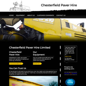
Chesterfield Paver Hire is a small company who had operated for years on word-of-mouth marketing. The owners decided to bring the company up-to-date and asked us to see what we could do.
We suggested that we first needed to provide a clear brand as it was deeply confusing for customers to see different colour schemes and logos on different paperwork and machinery.
![]()
This formed the basis of the design for a new website which describes the products available to hire simply and without clutter. We created some illustrations to show the machines alongside a simple specification table to make it easier to decide on the correct equipment.
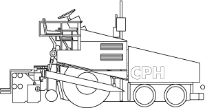
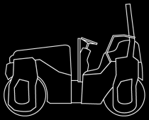
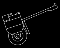
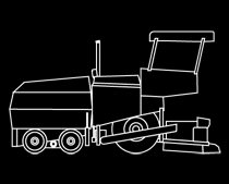
The heavy use of black evoked the environment the machinery is used in but we countered this with bright, large pictures of the most colourful machines in CPH’s collection. On the photoshoot we also captured a library of closeups of the machinery and road surfaces to use as textures where a non-specific image was needed.
We also thought it was important to add real-world quotes from current customers to give potential new customers a sense of trust.
Hiring large plant machinery is best done on a local basis to minimise transportation costs and logistics so the site was written in order to highlight the company’s location wherever possible which, along with the very relevant domain name aimed to boost the search engine ranking of the site.
The collection of several different telephone numbers and email addresses was also rationalised.
The new website and its associated brand has resulted in an increase in bookings because of the online forms.
The local approach we took with the search engine optimisation has seen Chesterfield Paver Hire go from nothing to being the top result in a Google search for “Paver Hire Chesterfield.”
Future plans will involve building on the initial success with CPH engaging, with our help, some social media marketing.